Have you noticed that regardless of your profession, you do a great job with your clients but neglect that same service on your own business?
Hence why our rebrand has been three years in the making. Not only that, in those three years we’ve developed three websites. Amongst prioritising our clients’ needs and deadlines, we’ve also been held back by the fear of being judged for what we’re supposed to be the best at. So you’ll understand our excitement at being able to finally announce that we’ve launched Alike – and we have a website to prove it!
The story behind our rebrand
It was always part of the plan to venture out as ‘Trent Penfold’. Trent was well-known in Brisbane’s advertising industry and we thought that was best to continue under his name while he took the first step going out on his own. We also wanted to differentiate ourselves from the big agencies. So we took a boutique approach whereby clients were able to contact Trent directly, first-hand. Once our business was well established, we always had the intention to rebrand. There are ‘for’ and ‘againsts’ for having a business under someone’s name. It has worked well with our strategy to date, which is about personalised, direct service. But it also has its limitations. One being that if you’ve ever met Trent, you’ll know that he’s a humble creative who doesn’t like the spotlight. Which is why we’ve remained quite elusive over 10 years of being in business.
The story behind our name
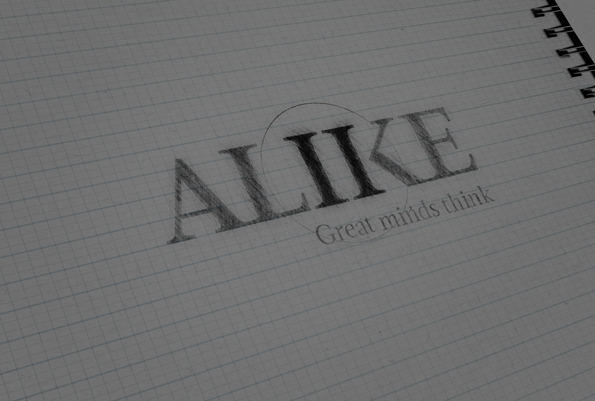
Whilst in a sleep-deprived haze with our first child in 2011, we came up with the name Alike. We’ve always felt that our strongest point isn’t so much the design, but the thinking behind it. Which is how we came up with our brandline: Great minds think. Alike pays homage to working as a collective – success is not created by one person, it’s created from many. Hence why the ‘great minds’ encompasses more than us. It represents those great business minds who we’ve been lucky enough to be associated with, who believe in branding and breakthrough thinking as strongly as we do. We’re tied together by the same emotion – ambition. Not ambition in the sense of doing whatever it takes to get what you want, but ambition in the humble sense of bringing people along on the journey together.
The story behind our logo
The two ‘I’s are taken from the ‘I’ and ‘K’ in Alike. They represent pillars of strength, unity and togetherness. It’s based on our belief that success is never attributed to just one person, it always takes two – and you only need two to make a great team. The symbol represents us and our clients. It also represents Trent and myself. In future, we hope that the two II’s represent a movement that ‘Great minds think alike’. We hope people resonate with our brand’s belief in the power of working together to create magic, through breakthrough thinking. It’s our vision to create a hub of great minds who continually strive to change the world with breakthrough thinking. Watch this space!

