
QSUPER
A Queensland icon 100 years strong
BRAND REFRESH
Until 2017, QSuper was Queensland’s largest Superannuation provider, exclusively for the Public Service. Now open to all, QSuper were undertaking more activities in market, and therefore needed a consistent approach across all brand touchpoints.
OUR THINKING
QSuper had a great strategic foundation to build upon in terms of brand promise. Their customer-first approach was genuinely lived, breathed and believed by their people, and research showed that they had the highest levels of member trust over any other Superannuation provider in Australia. There were Brand Identity elements needing to be refreshed or developed, to ensure consistency going forward. The challenge was that in the absence of usable brand guidelines, creative elements used at the campaign level were being rolled out at the brand level. Therefore a consistent brand approach, encompassing the way the brand looks, speaks and acts, in all environments and touchpoints, was developed.
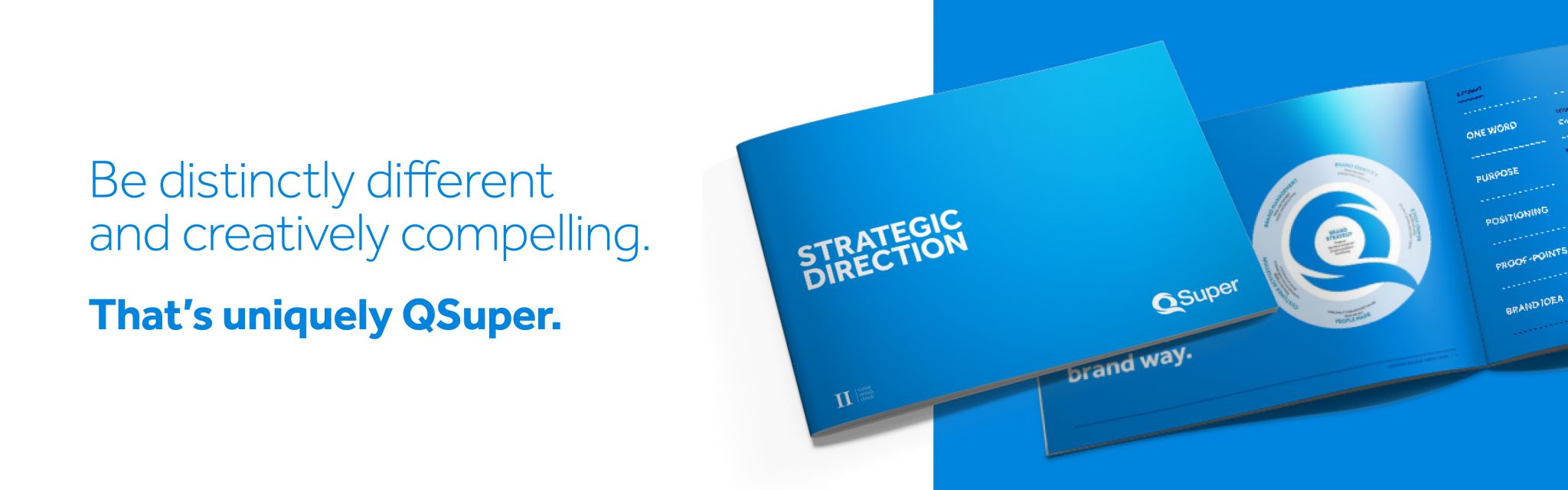
The result – we created a brand platform that looks, sounds and feels uniquely QSuper.
A great brand is never static. It's ever-evolving.


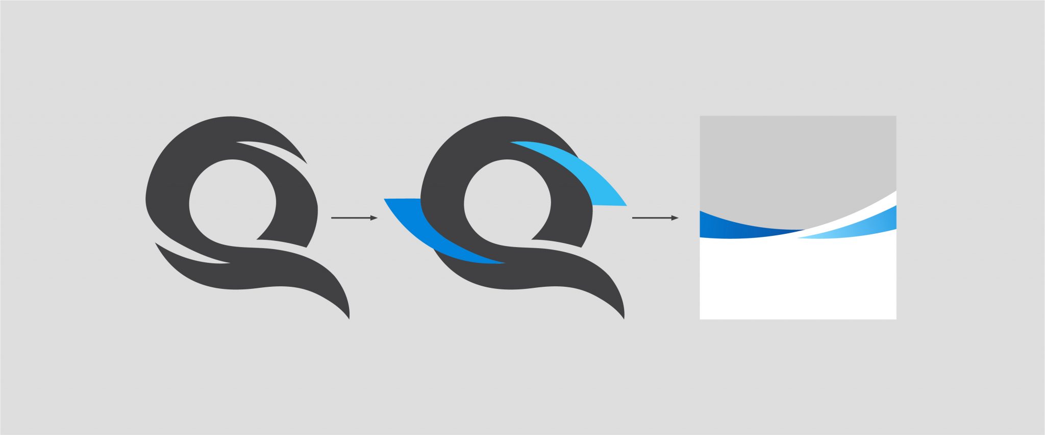
To add visual appeal and distinctiveness, our brand device represents two interlocking arms to symbolise strength,support and trust. The Q interlocking arms (Qarms) device has been created to build a consistent brand image that feels uniquely QSuper. Derived from the negative space within the Q symbol from our logo, the two arms interlock to form a template to house images and headlines. The two arms symbolise the partnership with our customers, and the active support and care we provide for their financial wellbeing.
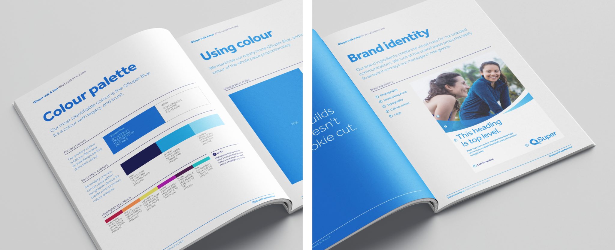
Our brand ingredients create the visual cues for our branded communications. We look at the overall piece proportionately to ensure it conveys our message in one glance.